Icons
Aios utilises Google Material icons and symbols, consistently opting for the following specifications:
- rounded style
- 400 weight
- grade 0
The standard optical size is 24px, but depending on the context, this may vary.
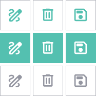
Depending on the context, filled or outlined icons can be used, provided they are applied consistently within the same context.
Custom icons may occasionally be required. These custom icons are available for download in PNG and SVG formats.
Icons are displayed on a transparent backround, in either:
- Puerto Rico
- White
- Medium Grey (usually for Disabled content)
Overlay Icons
Overlay icons are smaller icons placed on top of a primary icon to provide additional context or status information. They help indicate categorisations without requiring extra icons or text.
Use overlay icons when you need to indicate categorisation (e.g., a star overlay on a document icon for favourites), or to show status (e.g., a lock overlay on a folder icon for restricted access)
For example:
Frequently Used Icons
| Meaning | Colour | Used To | Material Symbol Name | |
|---|---|---|---|---|
| Error | Red | Accompany errors, critical warnings, or when action is required from the user | error | |
| Warning | Yellow | Accompany non-critical warnings | error | |
| Attention | Puerto Rico | Accompany actions or information related to recommended fields, or recommended actions to be taken by the user | error | |
| Success | Green | Accompany confirmation of successfully completed actions | check_circle | |
| Information | Mid Blue | Accompany additional information, or tips | info | |
| search | Search | Varies | Accompany search fields or search-related functions | search |
| delete | Delete | Varies | Accompany action buttons | delete |
| filter_list | Filter | Varies | Accompany filtering functionality or fields | filter_list |
| Clear | Medium Grey | Accompany various fields that can be cleared quickly | cancel | |
| close | Close | Medium Grey | Accompany components that can be closed | close |
CSS Properties
/*Interactive Icons*/
    .favourite-toggle {
        color: var(--Grey-l);
        cursor: pointer;
    }
    .favourite-toggle:hover {
        color: var(--Yellow-ml);
    }
    .favourite-toggle.selected {
        color: var(--Yellow);
    }

/*Overlay Icons*/

    /* Container for the primary icon and overlay */
        .icon-overlay {
            position: relative;
            display: inline-block;
        }

        /* Primary icon */
            .icon-overlay .icon-primary {
                font-size: 24px;
            }

            /* Overlay icons */
                .icon-overlay .icon-overlay-fave {
                    transform: scale(0.8);
                    position: absolute;
                    bottom: -3px;
                    right: -5px;
                    font-variation-settings:
                    'FILL' 1,
                    'wght' 600,
                    'GRAD' 0,
                    'opsz' 24;
                    color: var(--Yellow);
                    transform: scale(0.75);
                }

/*Frequently used*/
    .error-icon {
        font-variation-settings:
        'FILL' 1,
        'wght' 600,
        'GRAD' 0,
        'opsz' 24;
        color: var(--Red);
    }
    .warning-icon-amber {
        font-variation-settings:
        'FILL' 1,
        'wght' 600,
        'GRAD' 0,
        'opsz' 24;
        color: var(--Yellow);
    }
    .warning-icon {
        font-variation-settings:
        'FILL' 1,
        'wght' 600,
        'GRAD' 0,
        'opsz' 24;
        color: var(--PuertoRico);
    }
    .success-icon {
        font-variation-settings:
        'FILL' 1,
        'wght' 600,
        'GRAD' 0,
        'opsz' 24;
        color: var(--Green);
    }
    .information-icon {
        font-variation-settings:
        'FILL' 1,
        'wght' 600,
        'GRAD' 0,
        'opsz' 24;
        color: var(--MidBlue);
    }
    .clear-icon {
        font-variation-settings:
        'FILL' 1,
        'wght' 400,
        'GRAD' 0,
        'opsz' 24;
        color: var(--Grey-m);
      }

    .file-icon {
        font-variation-settings:
        'FILL' 1,
        'wght' 600,
        'GRAD' 0,
        'opsz' 24;
        color: var(--MidBlue-xxl);
    }

/*Frequent Colours*/
    .icon-color-puerto-rico {
        color: var(--PuertoRico);
    }
    .icon-color-white {
        color: white;
    }
    .icon-color-disabled {
        color: var(--Grey-m);
    }
    .icon-color-subtle {
        color: var(--Grey-ml);
    }

/* Dialogue Icons*/
    .dialogue-icon {
        color: var(--PuertoRico);
        margin: 5px;
        margin-right: 10px;
    }
    .dialogue-icon.error-icon {
        color: var(--Red);
    }
    .dialogue-icon.warning-icon {
        color: var(--PuertoRico);
    }
    .aios-dialogue-close-area .material-symbols-rounded {
        color: var(--Grey-ml)
    }
    .aios-dialogue-close-area:hover .material-symbols-rounded {
        color: white;
    }


/*In Columns*/
    th.icon-column,
    td.icon-column {
        width: 24px;
    }
    td.icon-column {
        position: relative;
        text-align: center;
    }
    td.icon-column span {
        position: absolute;
        top: 50%;
        left: 50%;
        transform: translate(-50%, -50%);
    }

    /*Sorting*/
        th .sort-icon {
            position: absolute;
            top: 10%;
            right: 45%;
            font-size: 18px;
            display: inline-block;
            transform: translateY(-50%);
            color: var(--Grey-m);
        }

/*Filters*/
    .filter-icon-wrapper {
        padding: 5px;
        margin-right: 5px;
        display: inline-flex;
        box-sizing: border-box;
        justify-content: center;
        align-items: center;
        border-radius: 5px;
        cursor: pointer;
        background-color: transparent;
    }
    .filter-icon {
        color: var(--Grey-m);
        transition: 0s;
    }
    .filter-icon-wrapper .material-symbols-rounded {
        font-size: 22px;
    }
    .filter-icon-wrapper:hover .filter-icon {
        color: var(--PuertoRico);
    }
    .filter-icon-wrapper:hover {
        background-color: var(--Grey-xxl);
        border-radius: 5px;
    }
    .filter-icon-wrapper.active {
        background-color: var(--PuertoRico);
    }
    .filter-icon-wrapper.active .filter-icon {
        color: white;
    }
    th:has(.filter-icon-wrapper) {
        padding-left: 5px;
        padding-top: 4px;
        padding-bottom: 4px;
    }
    th:has(.filter-icon-wrapper) > div {
        display: flex;
        align-items: center;
    }

/*Visual only icon for text filters*/
    .filter-icon-visual {
        position: absolute;
        right: 10px;
        margin-left: 8px;
        top: 40%;
        scale: 80%;
        transform: translateY(-50%);
        color: var(--Grey-l);
        pointer-events: none;
    }

/*RDOC Banner*/
    .RDoc-banner .expand_icon {
        color: var(--Grey-m);
        cursor: pointer;
        transition: transform 0.3s ease-in-out, color 0.0s ease-in-out;
        margin-left: auto;
    }
    .RDoc-banner .expand_icon:hover {
        color: var(--PuertoRico);
    }
    .rotated {
        transform: rotate(180deg);
    }

/*Expand icon on buttons*/
    .expand_icon {
        transition: transform 0.3s ease-in-out;
        margin-left: 5px;
        margin-right: 0px;
    }

/*Rotate Icon on hover*/
    .btn-dropdown-container:hover .expand_icon {
    transform: rotate(180deg);
    transition: transform 0.3s;
    }

/*Rotate icon back when not hovered*/
    .btn-dropdown-container .expand_icon {
    transition: transform 0.3s;
    }

/*Selection Chips*/
    .selection-chip .clear-icon {
        font-size: 20px;
        margin-left: 10px;
    }
    .selection-chip .clear-icon:hover {
        color: var(--PuertoRico);
        cursor: pointer;
    }