Buttons
Buttons come in different styles to convey hierarchy and importance.
There are four distinct types of buttons:
- Text-only buttons
- Icon-only buttons
- Buttons that combine text and an icon
- Dropdown buttons that include both text and an expand icon

Each button should maintain a consistent size, either full-sized or small-sized.
When space is limited, buttons can:
- Stack or shift
- Switch to a small size for responsive design purposes
Button behavior and appearance may vary depending on context, but the following general rules apply:
- Text-only buttons do not have a small-sized option.
- Small-sized buttons should not include an expand icon when it contains a drop-down list.
- Icon-only buttons are buttons that do not have text, and should be used sparingly to ensure usability and avoid confusion.
- Button responsiveness should begin from the right, as buttons are intentionally arranged in order of importance.
- Dialogues with a single button use the secondary button style.
- Button labels are displayed in Title Case and should use clear, concise, and user-friendly labels that describe the action being taken. Avoid vague terms like “Proceed” in favour of more descriptive alternatives like “View Results,” “Confirm Booking,” or “Start Tutorial.” This helps users understand exactly what will happen when they click a button.
Primary Buttons
- Used for the most important or prominent action(s) in an interface
- Stands out visually to attract user attention
- Used sparingly
Secondary Buttons
- Used for actions that are less critical than primary actions but still recommended
- Typically used to slightly emphasize a 'recommended' action
Tertiary Buttons
- Used for less important or secondary actions
- Minimalistic design to reduce visual noise
Disabled Buttons
When disabled, buttons retain a consistent appearance and behavior, regardless of whether they are primary, secondary, or tertiary, and irrespective of whether they include icons or dropdowns.
Button Tooltips
- Supplementary Information: Use tooltips to provide additional information or clarify the function of a button, especially when the button label or icon alone might not be sufficient.
- Unique Text: The tooltip text should not be identical to the button label unless the button is small-sized, where space limitations justify the repetition.
- Icon-only Buttons: Essential for icon-only buttons to explain their purpose and ensure users understand their function.
- Delay and Duration: Tooltips should appear after a short delay when the user hovers over a button and disappear once the user moves the cursor away. Tooltips should not appear if the user merely passes over the button without stopping.
- Appearance Timing: A common rule of thumb is to have a delay of about 500 milliseconds (0.5 seconds). This prevents tooltips from popping up immediately as the user moves the cursor across the screen.
Persistent Display:If the user moves the cursor to the tooltip itself, it should remain visible until the cursor leaves the tooltip area.- Dissapearance Timing: Tooltips should disappear immediately once the user moves the cursor away from the button, ensuring that the interface remains clean and that tooltips do not obstruct other UI elements
Buttons With Loading Indicators
- Provides immediate feedback that the user's click is being processed.
- Helps prevent frustration and assures users that their action is being handled.
- The button's icon temporarily transforms into a loader (regardless of button size, i.e. small buttons or full sized buttons).
- The button stays in a "clicked" state until loading is complete.
- Once the process is complete, the button returns to its normal state, indicating that the action has been successfully finished.
- For buttons without icons that require a loader, the loader will be added during the loading state, which may cause slight button resizing which should be fine in most cases. If this resizing causes additional issues, consider requesting a suitable icon to mitigate these concerns.
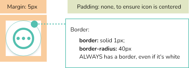
CSS Properties
/* Common Button Base */

.btn-base {
    min-width: 120px;
    height: 40px;
    border-radius: 40px;
    box-shadow: 0px 3px 6px rgba(0,0,0, 0.15);
    font-family: var(--base-font-family);
    font-size: 14px;
    text-transform: capitalize; /* This is causing issues and therefore will need to be done and checked for 'manually'*/
    font-weight: normal;
    white-space: nowrap;
    margin: 5px;
    cursor: pointer;
    transition: background-color 0.0s, border-color 0.0s, color 0.0s;
    padding: 0 25px;
    display: inline-flex;
    align-items: center;
    justify-content: center;
}

/*Disabled*/
    .btn-base:disabled,
    .btn-primary:disabled,
    .btn-secondary:disabled,
    .btn-tertiary:disabled,
    .btn-primary-dropdown:disabled,
    .btn-secondary-dropdown:disabled,
    .btn-tertiary-dropdown:disabled,
    .btn-primary-small:disabled,
    .btn-secondary-small:disabled,
    .btn-tertiary-small:disabled {
        color: var(--Grey-m);
        background-color: var(--White);
        border: var(--White) solid 1px;
        cursor: not-allowed;
    }
    .btn-base:disabled:hover,
    .btn-primary:disabled:hover,
    .btn-secondary:disabled:hover,
    .btn-tertiary:disabled:hover,
    .btn-primary-dropdown:disabled:hover,
    .btn-secondary-dropdown:disabled:hover,
    .btn-tertiary-dropdown:disabled:hover,
    .btn-primary-small:disabled:hover,
    .btn-secondary-small:disabled:hover,
    .btn-tertiary-small:disabled:hover {
        border: var(--White) solid 1px;
        background-color: var(--White);
    }

/*Disabled but with tooltip - SIMULATION / Example */
    .btn-disabled {
        @extend .btn-base;
        border: var(--White) solid 1px;
        background-color: var(--White);
        color: var(--Grey-m);
        cursor: auto;
    }

/* Primary button */
    .btn-primary {
        @extend .btn-base;
        border: var(--PuertoRico) solid 1px;
        background-color: var(--PuertoRico);
        color: var(--White);
    }
    .btn-primary:hover {
        border: var(--PuertoRico-d) solid 1px;
        background-color: var(--PuertoRico-d);
    }
    .btn-primary:active:not(:disabled) {
        background-color: var(--PuertoRico-xd);
        border-color: var(--PuertoRico-xd);
    }

/* Secondary button */
    .btn-secondary {
        @extend .btn-base;
        border: var(--PuertoRico) solid 1px;
        background-color: var(--White);
        color: var(--PuertoRico);
    }
    .btn-secondary:hover {
        background-color: var(--PuertoRico);
        color: var(--White);
    }
    .btn-secondary:active:not(:disabled) {
        background-color: var(--PuertoRico-d);
        border-color: var(--PuertoRico-d);
    }

/* Tertiary button */
    .btn-tertiary {
        @extend .btn-base;
        border: var(--White) solid 1px;
        background-color: var(--White);
        color: var(--PuertoRico);
    }
    .btn-tertiary:hover {
        border-color: var(--PuertoRico);
    }
    .btn-tertiary:active:not(:disabled) {
        background-color: var(--PuertoRico);
        color: var(--White);
    }

/*Dropdown Buttons*/

    /*Button itself*/
        .btn-primary-dropdown {
            @extend .btn-base;
            border: var(--PuertoRico) solid 1px;
            background-color: var(--PuertoRico);
            color: var(--White);
        }
        .btn-secondary-dropdown {
            @extend .btn-base;
            border: var(--PuertoRico) solid 1px;
            background-color: var(--White);
            color: var(--PuertoRico);
        }
        .btn-tertiary-dropdown {
            @extend .btn-base;
            border: var(--White) solid 1px;
            background-color: var(--White);
            color: var(--PuertoRico);
        }

    /*Container*/
        .btn-dropdown-container {
            position: relative;
            display: inline-block;
        }
        .btn-dropdown-container:hover .btn-dropdown-content {
            display: block;
        }

        /*keep buttons in hover state whilst hovering over dontent*/
            .btn-dropdown-container:hover .btn-primary-dropdown {
                border-color: var(--PuertoRico-d);
                background-color: var(--PuertoRico-d);
            }
            .btn-dropdown-container:hover .btn-secondary-dropdown {
                border-color: var(--PuertoRico);
                background-color: var(--PuertoRico);
                color: var(--White);
            }
            .btn-dropdown-container:hover .btn-tertiary-dropdown {
                border-color: var(--PuertoRico);
                background-color: var(--White);
            }

        /*Rotate Icon on hover*/
            .btn-dropdown-container:hover .expand_icon {
                transform: rotate(180deg);
                transition: transform 0.3s;
            }

        /*Rotate icon back when not hovered*/
            .btn-dropdown-container .expand_icon {
                transition: transform 0.3s;
            }

    /*Content*/
        .btn-dropdown-content {
            display: none;
            background-color: var(--White);
            box-shadow: 0px 3px 6px rgba(0,0,0, 0.15);
            border-radius: 10px;
            padding-top: 35px;
            padding-bottom: 10px;
            top: 40%;
            left: 5px;
            position: absolute;
        }
        .btn-dropdown-content a {
            color: var(--Black);
            padding: 10px 30px;
            text-decoration: none;
            display: block;
            font-size: 14px;
            font-family: var(--base-font-family);
            white-space: nowrap;
        }
        .btn-dropdown-content a:hover {
            background-color: var(--Grey-xl);
        }
        .btn-dropdown-container:hover .btn-dropdown-button {
            background-color: var(--PuertoRico);
            color: var(--White);
        }

/*Small buttons*/

    /*Common button base*/
        .btn-base-small {
            display:flex;
            width: 40px;
            height: 40px;
            border-radius: 40px;
            box-shadow: 0px 3px 6px rgba(0,0,0, 0.15);
            margin: 5px;
            justify-content: center;
            align-items: center;
            cursor: pointer;
            transition: background-color 0.0s, border-color 0.0s, color 0.0s;
            }

    /*Small Primary Buttons*/
        .btn-primary-small {
            @extend .btn-base-small;
            border: var(--PuertoRico) solid 1px;
            background-color: var(--PuertoRico);
            color: var(--White);
        }
        .btn-primary-small:hover {
            border: var(--PuertoRico-d) solid 1px;
            background-color: var(--PuertoRico-d);
        }
        .btn-primary-small:active:not(:disabled) {
            background-color: var(--PuertoRico-xd);
            border-color: var(--PuertoRico-xd);
        }

    /* Small Secondary Buttons */
        .btn-secondary-small {
            @extend .btn-base-small;
            border: var(--PuertoRico) solid 1px;
            background-color: var(--White);
            color: var(--PuertoRico);
        }
        .btn-secondary-small:hover {
            background-color: var(--PuertoRico);
            color: var(--White);
        }
        .btn-secondary-small:active:not(:disabled) {
            background-color: var(--PuertoRico-d);
            border-color: var(--PuertoRico-d);
        }

    /* Small Tertiary Buttons*/
        .btn-tertiary-small {
            @extend .btn-base-small;
            border: var(--White) solid 1px;
            background-color: var(--White);
            color: var(--PuertoRico);
        }
        .btn-tertiary-small:hover,
        .btn-tertiary-small:focus {
            border-color: var(--PuertoRico);
        }
        .btn-tertiary-small:active:not(:disabled) {
            background-color: var(--PuertoRico);
            color: var(--White);
        }

/*ICONS*/

/*Add a Right margin*/
    .icon-right-margin {
        margin-right: 5px;
    }

/*Expand icon on buttons*/
    .expand_icon {
        transition: transform 0.3s ease-in-out;
        margin-left: 5px;
        margin-right: 0px;
    }

/*TOOLTIPS*/
    .tippy-box[data-theme~='customrightleft'],
    .tippy-box[data-theme~='customtopbottom'] {
        background-color: var(--Grey-xd);
        color: #fff;
        font-size: 12px;
        font-family: var(--base-font-family);
    }

    .tippy-box[data-theme~='customrightleft'] > .tippy-arrow::before {
        border-right-color: var(--Grey-xd);
        border-left-color: var(--Grey-xd);
    }

    .tippy-box[data-theme~='customtopbottom'] > .tippy-arrow::before {
        border-top-color: var(--Grey-xd);
        border-bottom-color: var(--Grey-xd);
    }
Typescript
tippy('#tooltipTopBottom', {
    placement: 'top',
    animation: 'fade',
    theme: 'customtopbottom',
    delay: [500, 0],
    duration: 200,
    arrow: true,
    interactive: true,
    interactiveBorder: 10,
});

tippy('#tooltipRightBottom', {
    placement: 'right',
    animation: 'fade',
    theme: 'customrightleft',
    delay: [500, 0],
    duration: 200,
    arrow: true,
    interactive: true,
    interactiveBorder: 10,
});

tippy('#tooltipBottomBottom', {
    placement: 'bottom',
    animation: 'fade',
    theme: 'customtopbottom',
    delay: [500, 0],
    duration: 200,
    arrow: true,
    interactive: true,
    interactiveBorder: 10,
});

tippy('#tooltipLeftBottom', {
    placement: 'left',
    animation: 'fade',
    theme: 'customrightleft',
    delay: [500, 0],
    duration: 200,
    arrow: true,
    interactive: true,
    interactiveBorder: 10,
});