Navigation
Scroll Example:
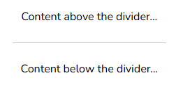
Dividers
Used to subtly separate or group content within sections.
They can be either horizontal or vertical and should maintain a consistent style and spacing across different components.
Horizontal line divider:
Veritical line divider:

Tabs
Tabs allow users to switch between different views or sections of content without leaving the current page, thereby enhancing usability and reducing clutter.
Visual Hierarchy: The active tab is visually distinguished from inactive tabs by being underlined.
Tab 1 Name
Tab 2 Name
Tab 3, etc
CSS Properties
/*SCROLLBAR*/

    *{
        scrollbar-color: var(--Grey-ml) var(--Grey-xxl);
        scrollbar-width: auto;
    }
    ::-webkit-scrollbar {
        min-width: 12px;
        min-height: 12px;
    }
    ::-webkit-scrollbar-track {
        background-color: var(--Grey-xxl);
    }
    ::-webkit-scrollbar-thumb {
        background-color: var(--Grey-ml);
        border-radius: 10px;
        border: 3px solid var(--Grey-xxl);
    }
    ::-webkit-scrollbar-thumb:hover {
        background-color: var(--Grey-md);
    }
    html {
        scroll-behavior: smooth;
    }


/*SPLIT GUTTER - as per class="as-split-gutter-icon" in Aios Settings*/


/*DIVIDERS*/

    /*Line dividers*/
        .divider-line {
            height: 1px;
            background-color: var(--Grey-l);
            margin: 10px;
        }


/*TABS*/
    .tabs-section-entire {
        margin-top: 2rem;
    }
    .aios-tab-container {
        position: relative;
        width: 100%;
        font-family: var(--base-font-family)
    }
    .aios-tab-header {
        display: flex;
        position: relative;
        border-bottom: 1px solid var(--Grey-xl);
    }

    .aios-tab {
        font-size: 14px;
        color: var(--Grey-d);
        padding: 10px 20px;
        cursor: pointer;
        transition: color 0.0s;
    }

    .aios-tab:hover {
        color: var(--PuertoRico);
    }

    .aios-tab.active {
        color: var(--PuertoRico);
    }
    .aios-tab-indicator {
        position: absolute;
        bottom: 0;
        height: 3px;
        background: var(--PuertoRico);
        transition: left 0.3s;
        border-radius: 0px 0px 5px 5px;
    }
        /* Styles for the tab content */

        .aios-tab-buttons-container {
            position: absolute;
            right: 0;
            top: 1rem;
        }
        .aios-tab-content {
            padding: 1rem;
            color: #000000;
            height: 250px;
            position: relative;
        }
        .tab-content {
            display: flex;
            flex-wrap: wrap;
            align-items: flex-start;
            gap: 1rem;
        }
        .tab-text {
            margin: 60px auto auto auto;
            justify-content: left;
            position: relative;
        }

        .dummy-page {
            width: 500px;
            height: 10px;
            background: white;
            box-shadow: 0px 4px 10px rgba(0, 0, 0, 0.2);
            padding: 20mm;
            margin: 70px auto auto auto;
            display: flex;
            justify-content: center;
            position: relative;
        }

    .code-snippet-2 pre {
        max-height: 500px;
        overflow: auto;
    }
    .code-snippet pre {
        max-height: 500px;
        overflow: auto;
    }

/* REPORTING PORTAL DROPDOWN MENU */

    .Reporting-navbar {
        height: 50px;
        background-color: var(--PrussianBlue-d);
        display: flex;
        align-items: center;
        z-index: 1000;
        padding: 0px;
        border: none;
    }
    .Reporting-navbar-logo {
        height: 25px;
        width: auto;
        padding: 0px 10px;
    }
    .Reporting-navbar-header {
        color: white;
        font-family: var(--heading-font-family);
        font-size: 18px;
    }

    /* Dropdown */

        .Reporting-menu-dropdown {
            position: relative;
            display: inline-block;
        }
        .menu-btn {
            height: 50px;
            width: 50px;
            background-color: var(--PrussianBlue);
            color: white;
            border: none;
            cursor: pointer;
        }
        .menu-btn:hover {
            background-color: var(--PuertoRico);
        }

        .Reporting-menu-dropdown-content {
            visibility: hidden;
            opacity: 0;
            position: absolute;
            padding: 30px;
            top: 100%;
            left: 0;
            background-color: var(--PrussianBlue);
            min-width: 400px;
            border-radius: 0 15px 15px 15px;
            overflow: hidden;
            box-shadow: 0px 3px 6px rgba(0,0,0, 0.15);
            display: grid;
            grid-template-columns: repeat(2, 1fr);
            grid-gap: 10px;
            transition: visibility 0s, opacity 0.3s ease;
        }

        /* Dropdown options */

            .Reporting-menu-dropdown-content button {
                width: 100%;
                padding: 10px;
                text-align: center;
                background: none;
                border: 1px solid rgba(255, 255, 255, 0.5);
                border-radius: 15px;
                color: white;
                cursor: pointer;
                font-size: 16px;
                font-family: var(--heading-font-family);
                display: flex;
                flex-direction: column;
                align-items: center;
                justify-content: center;
            }
            .Reporting-menu-dropdown-content button:hover {
                background-color: var(--PuertoRico);
                border-color: var(--PuertoRico);
            }
            .Reporting-menu-dropdown-content button:disabled {
                background-color: var(--PrussianBlue);
                color: var(--Grey-m);
                cursor: not-allowed;
                border: none;
            }
            .Reporting-menu-dropdown-content button span {
                margin-bottom: 5px;
            }
Javascript
document.addEventListener('DOMContentLoaded', function() {

    // Tabs
    const tabs = document.querySelectorAll('.aios-tab');
    const indicator = document.querySelector('.aios-tab-indicator');

    function updateIndicator(tab) {
        const tabWidth = tab.offsetWidth;
        const tabOffsetLeft = tab.offsetLeft;
        indicator.style.width = `${tabWidth}px`;
        indicator.style.left = `${tabOffsetLeft}px`;
    }

    // Set initial position for the first active tab
    const activeTab = document.querySelector('.aios-tab.active');
    if (activeTab) {
        updateIndicator(activeTab);
    }

    tabs.forEach(tab => {
        tab.addEventListener('click', function() {
            tabs.forEach(t => t.classList.remove('active'));
            this.classList.add('active');
            updateIndicator(this);
            const tabNumber = this.dataset.tab;
            document.querySelectorAll('.tab-content').forEach(content => {
                content.style.display = content.id === `tab-${tabNumber}-content` ? 'block' : 'none';
            });
        });
    });
});

// Reporting portal
// Get the heading and all the dropdown options
const heading = document.getElementById('navbar-heading');
const options = document.querySelectorAll('.Reporting-menu-dropdown-content button');
const menuButton = document.querySelector('.menu-btn');
const dropdownContent = document.querySelector('.Reporting-menu-dropdown-content');

// Toggle dropdown visibility when clicking the menu button
menuButton.addEventListener('click', function(event) {
    event.stopPropagation(); // Prevent the click from bubbling up to the document
    const isVisible = dropdownContent.style.visibility === 'visible';

    // Toggle the visibility and opacity
    dropdownContent.style.visibility = isVisible ? 'hidden' : 'visible';
    dropdownContent.style.opacity = isVisible ? '0' : '1';
});

// Add event listeners to the options
options.forEach(option => {
    option.addEventListener('click', function() {
        // Update the heading with only the text content, excluding the span
        const optionText = option.querySelector('span')
            ? option.textContent.replace(option.querySelector('span').textContent, '').trim()
            : option.textContent.trim();
        heading.textContent = optionText;

        // If the option is not already disabled, disable it
        if (!option.disabled) {
            // Enable all buttons first
            options.forEach(btn => btn.disabled = false);

            // Now disable the clicked button
            option.disabled = true;
        }

        // Close the dropdown after an option is selected
        dropdownContent.style.visibility = 'hidden';
        dropdownContent.style.opacity = '0';
    });
});

// Close the dropdown if clicking outside of it
document.addEventListener('click', function(event) {
    if (!dropdownContent.contains(event.target) && !menuButton.contains(event.target)) {
        dropdownContent.style.visibility = 'hidden';
        dropdownContent.style.opacity = '0';
    }
});